While lawyers write a lot of documents, they don’t often consider the style of font of the characters (letters and numbers) used to produce the document. Yet fonts (and other typography matters) are important. No lawyer would consider using the same type of script font that may be found on a wedding invitation in an appellate brief, and that’s a good thing.
Yet most lawyers don’t ever consider that there are alternatives to the Time New Roman font that may be the default font in your word processing program. They should. I consider Time New Roman to be boring because by using it your document is going to look like almost every other legal document in existence. In his book, “Typography for Lawyers,” Matthew Butterick’s distaste for this font is even stronger and he recommends lawyers avoid it entirely. Butterick states: “Time New Roman connotes apathy.” He believes that in using it, you’ve “submitted to the font of least resistance.”
Of course, if your appellate practice is principally before the Alabama Supreme Court, as mine has been, you cannot even use Times New Roman. You are constrained by the appellate rules to use a font that is even worse, Courier New. Butterick describes Courier New as”spindly, lumpy, and just plain ugly.” I dislike the font in large part simply because it is a monospaced font, meaning that each character in a word is give the same space regardless of whether it is a narrow “i” or a fat “m.” This makes each word take up more line space and allows for fewer words on each line. Frankly, I find Courier New to be difficult to read page after page and when writing a brief for the Alabama appellate courts I often find myself yearning for the ability to use a different, more easily readable font.

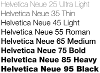
One theme that I write about in this blog is that in preparing an appellate brief, I want the brief to be easily readable and the one that the court turns to repeatedly in deciding the appeal. I want my brief to be less like a boring legal document and more an interesting, easily-readable non-fiction magazine article, newspaper, or book. Of course, font type affects readability and while I want a font to be more readable than Time New Roman or Courier New, I also don’t want a font that would appear unfamiliar or distinctly out of place. Thus, some of the fonts found standard on word processing programs that I prefer are Helvetica (which is sans-serif), Palatino Linotype, Bookman Old Style, and Book Antiqua. Butterick, a bit of a font snob, recommends fonts that are available for purchase and downloading to your computer, but which he believes provide a better appearance, such as Starling, Palatino Nova, Miller or Lyon. The font used for this blog text, based on the limited options available (and excluding Courier New and Georgia) is Lato, a more modern-appearing sans-serif font appropriate for a blog.